This weekly debrief is for paying supporters of my work. Please only read if you’ve paid. Thanks!
→ Click here if you've paid ←
This week I rewrote the user manual for Torque, released Torque on itch.io, and created new logos for Torque and Bedrock.
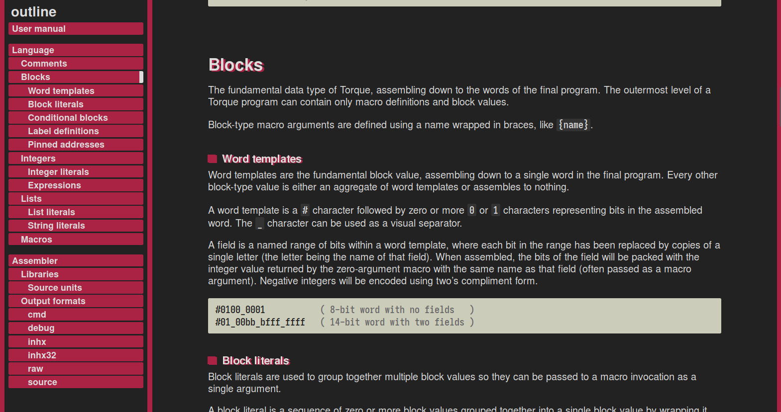
Torque user manual
The original user manual for Torque is not very good in my eyes, it reads like a high-speed collision between a quick-start guide and a syntax definition. I’ve improved a lot with my writing since then, so now was a good opportunity to rewrite the whole thing from scratch in time for the version 3 release.
I find that designing the structure of a user manual is always really challenging (well, designing the structure for any piece of documentation, really). There are so many reasons for someone to be reading a user manual — skimming it to get a quick overview, learning the language by studying examples, reading closely to find the solution to a specific problem — and it just isn’t possible for a single document structure to work for every possible case.
The final structure groups each language element by the type of value it assembles to, starting with comments (no value), moving to blocks (the fundamental data type), then integers and lists (getting fancier), and finally macros (where the real power of the language lies). Grouping the manual like this should be useful for finding a particular feature, while also tracing somewhat of a narrative if you read it from top to bottom.
Fizzbuzz in Torque
I awoke one morning, bleary-eyed and foggy-brained, with a beautiful vision before me of fizzbuzz implemented as a macro in Torque. It works by using a recursive macro for iteration, and another recursive macro to encode an integer as a decimal string. I had a ball of a time implementing it before breakfast that day.
%BYTE:n  #nnnnnnnn;

( Convert an integer to a decimal string. )
%DECIMAL:n
  ?[n 10 <geq>] DECIMAL:[n 10 /]
  BYTE:[n 10 <mod> '0' +];

( Implement fizzbuzz. )
%FIZZBUZZ:i:end
  ?[i 3 <mod> 0 =] BYTE:"fizz"
  ?[i 5 <mod> 0 =] BYTE:"buzz"
  ?[i 3 <mod> 0 =
    i 5 <mod> 0 =
         <or> 0 =] DECIMAL:i
  BYTE:0x0A
  ?[i end <] FIZZBUZZ:[i 1 +]:end;

( Use fizzbuzz. )
FIZZBUZZ:1:20
The DECIMAL macro takes an integer n and assembles to the value of that integer as a decimal string. If n is 10 or greater, it calls itself with n divided by 10, and then it outputs the final digit of the value (n modulo 10) as an ASCII byte.
The FIZZBUZZ macro takes a start value i and an end value end, and iterates over all values between the two by calling itself with i plus 1 until i is equal to end. With each invocation, it will assemble to the strings fizz, buzz, fizzbuzz, or the value i as a decimal string.
A logo for Torque
Torque has needed a logo for a long time. I had the idea to make it look like the sort of logo that you might find on the side of a toolbox or power drill, with clean lines and an even-stroked typeface that looks like bent pipe. The lowercase characters are supposed to evoke the feeling of being small and low-level, and the italics make it feel zippy.
For the diegetic version, I wanted to make it look like one of those routed labels attached to power poles or utility boxes, the kind of label you don’t look twice at when you’re walking around. Very industrial and matter-of-fact, to drive in the feeling of being an assembler, a basic but essential tool of the trade. The typeface used for the ‘meta assembler’ subtitle is Gorton (explored beautifully in this essay), and the screw heads on either side are Torx heads (as a visual pun).
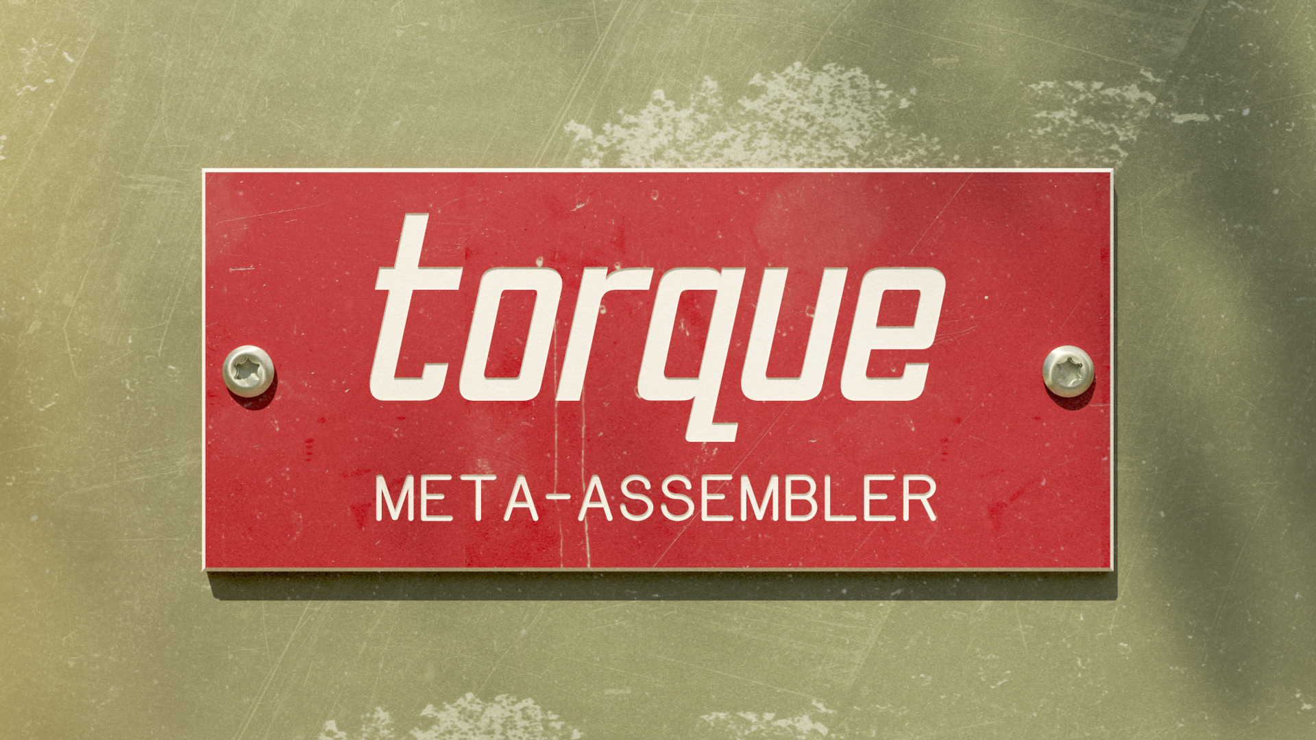
The materials are layered heavily with scratches, lichen, dust, and greasy fingerprints, and a dappled shadow in the upper-right implies a larger scene out of the frame. I’m really happy with the feeling of weight and substance it conveys.
I was having a hard time being satisfied with the red-green colour scheme while I was working on the image. They were the only two colours that worked — the dull green screams ‘utility box’, and the red label pops in a way that none of the other colours did — but it just kept looking like a sun-bleached christmas decoration. It needed some zing, some pow. I didn’t think that anyone would take a new assembler seriously if the logo looked like a dust-choked power tool, assemblers need all the help they can get as it is.

This is the final look that I ended up going for. It’s just the original image after being passed through a dozen or so rounds of the hue-saturation tool to really crunch and fry the colours. I dunno, I really like it but I can’t quite put my finger on why. Maybe the feeling that it doesn’t take itself too seriously? It looks like you can have fun while using it, which is not an oft-promoted feature of assemblers these days.
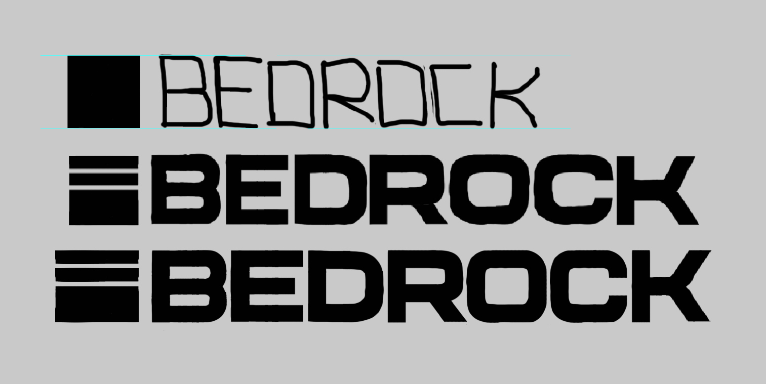
A logo for Bedrock
I also needed to create a logo for Bedrock, to use in my upcoming projects and to replace the flat-looking screenshot on the project page.
The typeface was inspired, humorously enough, by the wide typeface used in ads for the iPhone Pro (about as far from bedrock as you can really get). I wanted a feeling of solidity, a logo that felt blocky but also soft and approachable. The square logo to the left is an illustration of where Bedrock sits in the stack (rock bottom), and is simple enough to be drawn as a 1-bit sprite inside Bedrock itself (with the bytes ff00 ff00 ffff ffff).
For the diegetic version, I’ve drawn the logo projected onto an old amber CRT monitor, smeared with old dust and fingerprints. I wanted it to look warm, tangible, and alive; a living, breathing machine. Something you can reach out and touch, where you can feel grit and static beneath your fingertips.
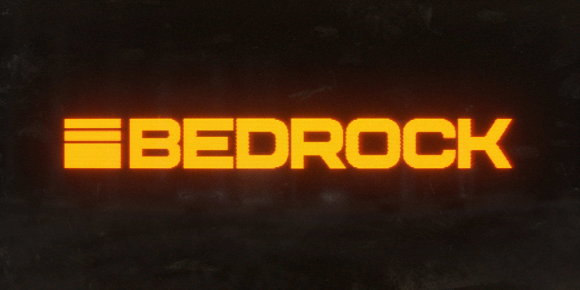
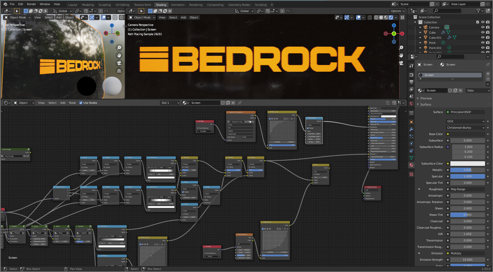
I took a lot of inspiration for the CRT effect from MRMO-CRT. It wasn’t quite what I needed, but it got me started down the right path with messing around in UV space.
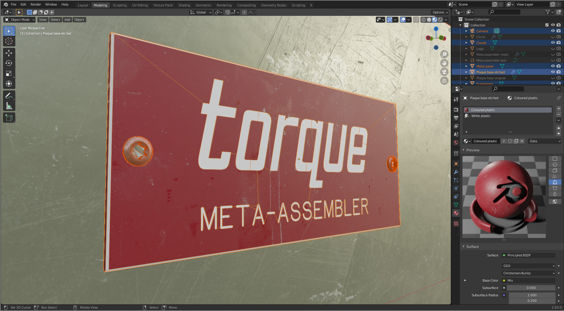
When I create these logos, I start with hand-drawn sketches, develop them over multiple iterations with Photoshop, and then trace them with bezier curves in Blender to get high-res black-and-white logos. I dabbled briefly with using Illustrator for this step, but it’s a real nuisance to use compared to just doing everything in Blender.
Thanks
That’s enough for this week, it’s getting late. Thank you to everyone for supporting my work, it means the world to me.