This weekly debrief is for paying supporters of my work. Please only read if you’ve paid. Thanks!
→ Click here if you've paid ←
This week I’ve been focused on developing the logo and the overall aesthetic for DERELICT ENGINEERING, the studio name that I’m using for all of my released work.
Derelict Engineering
I post my work under my own name on the internet, but I also release my work under the one-person studio DERELICT ENGINEERING as a way to bring all my best work together with a unified aesthetic and a common purpose.

Until now I hadn’t come up with a good logo or font that I could use, and I only had a rough idea of what I wanted it to look like. I find that a project doesn’t become real for me until it has a name and a logo; a project needs some way for people to identify with it, something that people can rally behind.
I toyed around with using a symbol from a circuit diagram as a logo, but that was a dead end. All of the symbols I could find are too generic, and yet somehow at the same time too hard to recognise.
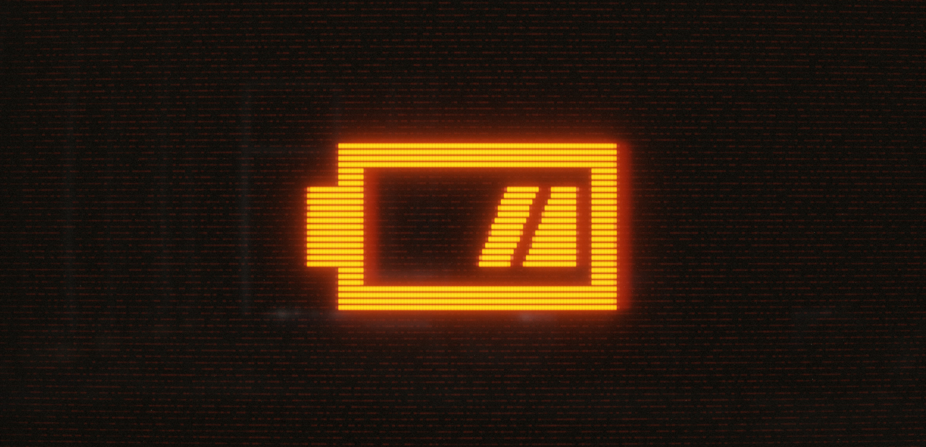
Everything fell into place once I came up with the battery logo below. It’s bold, simple, recognisable at a glance, and it encompasses everything that I want to communicate: it evokes technology, it’s derelict in the sense of used up / abandoned, and the two slashes within the battery look like the // comment delimiter in many C-style programming languages, representing dead code and discarded ideas — my favourite sources of inspiration.

The idea behind the name was to go against the norm of naming technology groups after slick, high-tech concepts (Quantum Systems, Silicon Innovations, that sort of thing). I don’t want to be high-tech, I just want to make small and useful systems that use minimal resources and that keep running even through the apocalypse. I wanted to evoke a sense of a crumbling behemoth, the wreckage of decades of computing history piled deep in a valley, long forgotten. Of foraging for inspiration in the works of Codd, of Dijkstra, of Wirth.
To match the name, I’m leaning heavily into the aesthetic of a glowing amber CRT, with warm tones and gritty textures (in contrast to the slick, smooth, cool tones used by almost every technology company today).
This is as much an art project as a technology project, the two go hand-in-hand.
Patreon
The reason why I’m getting into all of this design work this month is that I’m working towards setting up an account on patreon.com, as another way for people to support my work.
As part of setting up the account, I need a lot of different design assets: a banner image, profile picture, art for membership tiers, that sort of thing. I’ve been wanting something along those lines to use on Mastodon and other places as well, so it’s been a good excuse for me to finally start working on them. I’m using Blender to create all of the assets, it’s the tool that I’m by far the most familiar with.
I’m still working on getting everything all set up for the account, I’m planning on making it public by the end of the month.

Thanks
Finally, thank you to everyone for supporting my work. I wouldn’t be able to do all this without you!